
ohsixspeedsix
Owl Exterminator!!
Here is our new logo.
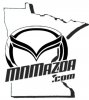


I'd just make the flying M a lot smaller....like about half the size it is. That way there's more focus on the mnmazda.com logo. Otherwise, (as Dan mentioned it looking cluttered) it's causing the 3 elements of the whole thing to compete again each other. I'm staying in for 2 no matter what the end result is, whether further changes are made or not. Just looking forward to getting them before the Superbowl.Some constructive criticism on that...
I would get rid of the MN borders within the flying M. Makes it look more cluttered; I think we get the idea without them.

lol, I'd be game for one with AJ & Packers & Vikings Suck!Granted it's only my opinion, but I think the revised retro logo looks awesome!! I'd like it on a pair of beer mugs for sure.
Hey Tom, how much extra would I have to pay to get "Packers Rock" on Line 1, "Vikings Suck" on Line 2 on the mugs opposite the new logo rather than my screen name?
x2That does really look a ton better, nice one Hayden.

I dinno. I think it's funnier to tell you NO and leave it at that. *maybe* we can discuss it, but after the way everyone's been pissy so far, I don't know how in the mood I am to accept custom requests without a decent bribe. I do like bribes though.Granted it's only my opinion, but I think the revised retro logo looks awesome!! I'd like it on a pair of beer mugs for sure.
Hey Tom, how much extra would I have to pay to get "Packers Rock" on Line 1, "Vikings Suck" on Line 2 on the mugs opposite the new logo rather than my screen name?
