StickyGeek
Sponsor
Just text?Need a sticker! Readable font
This car contains 0% Plastidip!
Color?
Size?
")
Just text?Need a sticker! Readable font
This car contains 0% Plastidip!
Logos I can doNo, having a hard time getting a decent cutout of the Rota logo, mixed with the right font. Will try some more later. Cooking right meow.
Just show me what you are thinking off for fonts and layout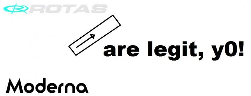 I'll be able to make my own though
Ok, after much picking at MSPaint (my work rig was the one with photoshop on it) I managed to come up with this-
I made the S on the Rota setup myself, since Rotas isn't really written in their font anywhere. It's kinda messy, but you get the idea. As far as the layout, I sorta detailed it. I want the rota thing I made, or an approximation of it, going upward at an angle, ahead of the "a" in "are legit, y0" The closer the two are to equal size, the better. As far as the font for the are legit, I pasted that Moderna font example in there, because that's the font I want, only bolder, if possible, otherwise that is pretty solid. All lowercase letters. Make any sense?

Just tell me what you are looking forI think I may need a different sticker. Hmmmm
OMG YES! That's perfect. I see my S didn't turn out terrible when a professional got a hold of it.
LOL. I just found the font Rota uses and it gave me an "S"OMG YES! That's perfect. I see my S didn't turn out terrible when a professional got a hold of it.

